How I Turn SaaS Visitors Into Trial Users With Claude, Figma, and Framer
Most SaaS websites lose visitors because they get one thing wrong: they talk about themselves instead of the visitor.
Features. Tech stack. Team photos. All useful, but not on the page that's supposed to convert.
The pages that convert hit three things first: proof, benefit, and understanding. Every site I build for a client runs through that filter before anything else.
Here's the full process.
The 3 Things Every SaaS Website Needs
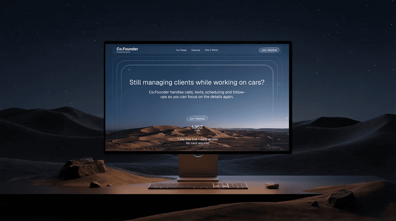
Proof. Social proof, case studies, testimonials. Show that what you sell actually works for other people. B2C uses testimonials. B2B uses case studies and client results.
Benefit. All the language and design point at what the visitor gets. Not what your product does. Not what your team built. What changes for them when they use it.
Understanding. Anyone landing on the page should understand what you do in seconds. Use industry language, but keep it simple enough that someone with a vague understanding still gets it.
Miss any of these and your bounce rate climbs. The visitor doesn't see themselves on the page, so they leave.
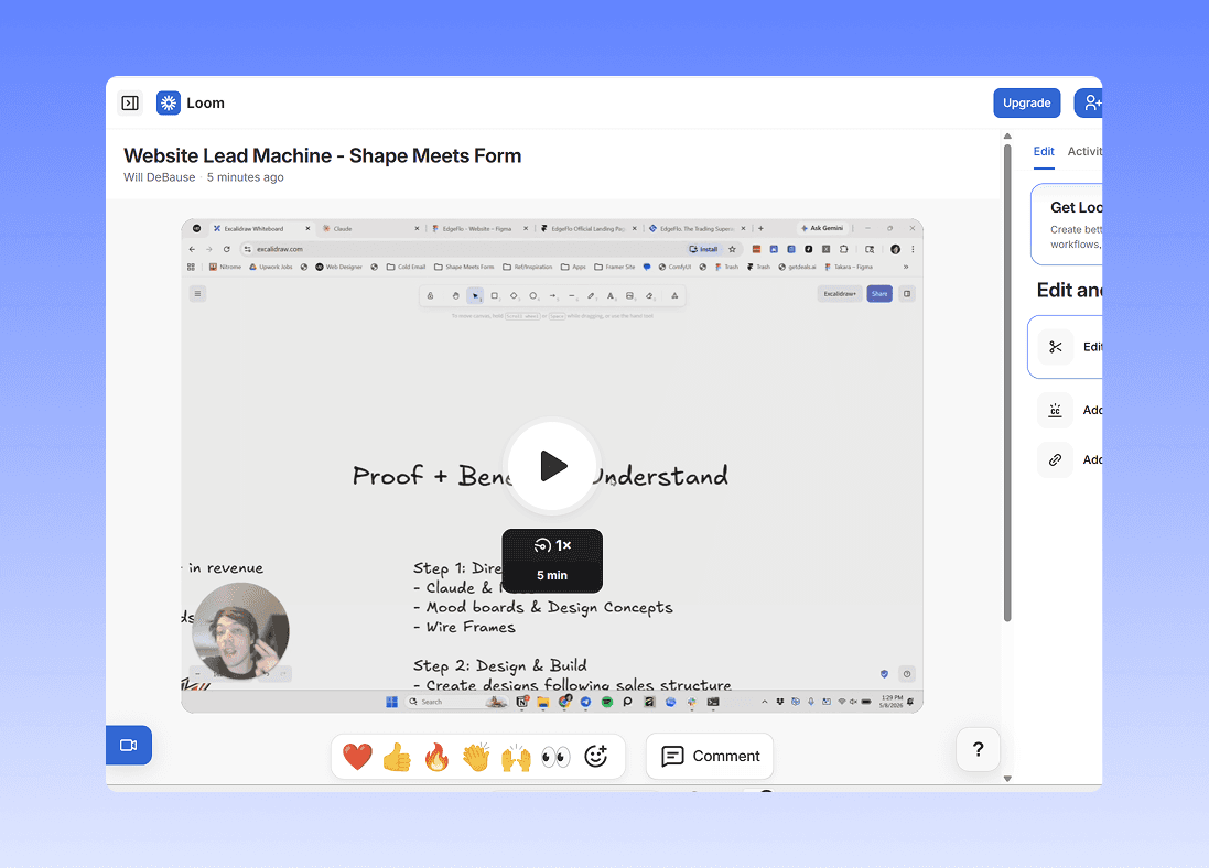
Step 1: Direction (Claude)
I build a Claude project for every client. Inside it:
- Feature breakdowns
- Project context
- Brand voice and tone
- Research prompts
Everything Claude outputs stays factual and on-brand because the project knows the product.
From there, I use Claude to build mood boards, pull design concepts, and structure wireframes. Pinterest gets pulled in for visual references. Copy gets drafted in the same project.
The whole goal of step 1: get the proof, benefit, and understanding locked in before anything visual exists.
Step 2: Design (Figma)
Take everything from the Claude project and design it.
Figma is my tool. You can design in Framer directly if you want.
The design itself stays structured around the same three things:
- Proof up top (real dashboards, testimonials, client logos)
- Benefit-led headlines
- Clear, simple language anyone in the industry can read
For B2C: testimonials. For B2B: case studies with real client results.
Step 3: Build (Framer)
Import the Figma file into Framer. Make it live.
Then set up the part most people skip: SEO, tracking, and A/B testing.
You put all this work into a site. You need to know if it's working.
- Are people clicking what you want them to click?
- Is one version converting better than another?
- Where's traffic dropping off?
Refine and tweak until the data says it's converting.
The Result
A site that takes traffic and turns it into users.
Same process for B2C and B2B. The only thing that changes is the proof type (testimonials vs case studies).