The Website
Sales Playbook.
A practical guide to how a website turns visitors into qualified conversations — the sales path every page needs, the friction that quietly costs you leads, and how to score and improve your own page, section by section.
Build for cold traffic, convert more warm traffic.
A strong website should move a cold visitor through five steps: they understand who you help, they understand what you offer, they see why they should trust you, their main doubts get answered, and they know exactly what to do next.
A page built for cold traffic has to do the hard work: explain the offer, build trust, answer doubts, and make the next step clear. When that path is clear for cold visitors, warm visitors move through it faster.
Who it is for
The visitor should know whether the offer is meant for them.
What the offer is
The visitor should understand what they get without piecing it together.
Why they should trust it
Proof needs to appear before the visitor is asked to act.
What doubts need answering
The page should handle friction before it becomes a reason to leave.
What to do next
The action should be specific, visible, and easy to take.
Build for cold traffic first.
Cold traffic has no context. It does not know the company, the offer, the proof, or why the next step is worth taking.
That is why the page has to explain more than a warm referral would need: make the offer clear, show why it matters, prove the company can deliver, and make action feel low-friction. When the page works for cold visitors, warm visitors move through it with less resistance.
Cold traffic
Needs clarity, context, proof, and a clear reason to keep reading.
Warm traffic
Needs confirmation, stronger proof, and a specific next step.
Returning traffic
Needs details, confidence, process clarity, and risk reduction.
What every website needs to make clear.
Every website has a few things it must make clear before a visitor is ready to act. These are the core pieces your page needs to land — quickly, and without making the visitor work for them.
Audience
Who the page is for. A visitor should know within seconds whether the offer is meant for them.
Offer
What the visitor gets. The core offer should be clear without piecing it together from several pages.
Outcome
The result the offer points toward — the improvement or change a buyer actually cares about.
Trust signals
What proof is easy to find. The strongest evidence you have should appear before the ask.
Main conversion action
The primary step the page should move every visitor toward, stated plainly and repeated.
Match the message to where they came from.
The page should match the reason someone arrived. A visitor from search needs fast clarity. A referral needs proof. Outbound needs context. Someone comparing options needs specifics. The stronger the match between the traffic source and the page message, the less work the visitor has to do.
Search traffic
Needs the page to confirm the problem, offer, and relevance fast.
Referral traffic
Needs proof that backs up the recommendation.
Outbound traffic
Needs context, because the visitor did not ask to be there.
Comparison traffic
Needs specifics, proof, differentiation, and risk reduction.
The conversion scorecard.
A conversion-focused page can be scored section by section. The goal is not to decide whether the website is good or bad. It is to find the parts of the sales path that are unclear, unsupported, or harder to act on than they need to be. Score your own page as you read.
First-screen clarity
Can a cold visitor understand the offer without scrolling?
Audience clarity
Is it obvious who the offer is for?
Offer clarity
Is it clear what the visitor gets?
Outcome clarity
Is the result or value easy to understand?
Proof placement
Does proof appear before the visitor is asked to act?
Objection handling
Are the main doubts answered on the page?
CTA clarity
Is the next step specific and easy to find?
Mobile path
Is the page easy to understand and act on from a phone?
Load confidence
Does the page feel fast, stable, and polished?
Follow-up path
Is there a way to stay connected if the visitor is not ready yet?
The proof ladder.
Proof should appear before the visitor is asked to act. The stronger the ask, the stronger the proof needs to be. A simple signup may only need a clear promise. A demo, quote, or sales conversation needs trust, context, and evidence that the company can deliver.
Basic proof
Team, credentials, certifications, years in market, recognizable clients.
Visual proof
Screenshots, examples, product views, project samples, before-and-after context.
Social proof
Testimonials, reviews, ratings, press, partner logos.
Outcome proof
Case studies, numbers, specific wins, measurable improvements.
Risk-reversal proof
Process clarity, support, onboarding, security, compliance, guarantees where relevant.
What creates friction.
Most conversion problems are not design problems first. They are friction problems. The visitor wants to know what this is, why it matters, why they should trust it, what it will cost them, what happens next, and what could go wrong. The page should answer those questions before they become reasons to leave.
Unclear offer
The visitor has to work to understand what is being sold.
Weak proof
The visitor cannot tell why they should trust the company.
Vague next step
The visitor does not know what happens after clicking.
Too much effort
Long forms, extra clicks, hidden contact options, unclear paths.
Unanswered risk
Pricing, timing, implementation, security, support, fit, or results are unclear.
The 7 sections of a website that converts.
A website that converts is not just a collection of sections. Each section has a job: make the offer clear, build trust, answer doubts, and move the visitor toward the next step.
Hero: make the offer clear fast
The first screen should tell visitors who it is for, what they get, and why it matters.
Trust strip: prove they are in the right place
Logos, reviews, numbers, credentials, or recognizable proof reduce doubt early.
Problem: show you understand the buyer
The page should name the situation the visitor is trying to fix.
Offer: explain what they get
Make the product, service, or process easy to understand without extra clicks.
Proof: back up the promise
Use real testimonials, case studies, examples, results, or before-and-after context.
Process: remove uncertainty
Show what happens after someone reaches out, signs up, books, or buys.
CTA: make action obvious
Use one clear action, repeated at the right moments, with a specific outcome.
If the first screen tries to say everything, it says nothing. Earn the scroll first.
The 30-day website improvement plan.
The goal is not a prettier website. It is a clearer sales path that turns the right visitors into qualified conversations.
Map the sales path
Clarify the audience, offer, outcome, proof, buyer doubts, and primary conversion action.
Rewrite the page
Rewrite the hero, offer, trust, process, objection handling, and CTA flow.
Design and build
Turn the structure into a page that works on desktop and mobile, with a clear path from first visit to action.
Launch and measure
Track scroll, clicks, form starts, completions, booked calls, and drop-off points.
What to measure after launch.
The first version should not be treated as finished. After launch, the page shows where visitors slow down, what they click, what they skip, and where they leave. That data is the input, not the goal: each signal points to a specific change in the copy, the design, or the layout that can lift conversions. Measure, learn, change, repeat.
Hero
Scroll depth, CTA clicks, bounce rate, first-click behavior.
Offer section
Scroll continuation, clicks to product or service details, time on section.
Proof section
Case study clicks, testimonial visibility, review clicks.
CTA section
Button clicks, form starts, form completions, booked calls.
Mobile path
Tap behavior, form completion rate, abandoned forms, rage clicks.
Where to look first on your own site.
Before any rebuild, a few quick checks surface most of the easy wins. Open your own site and look at these first — they are the places where the sales path most often goes unclear for a cold visitor.
The first message
Read only the first screen of your homepage. Can a stranger tell who it is for and what you do — without scrolling, and without prior context?
The main call to action
Find your primary next step. Is it obvious, specific, and repeated, so a ready visitor never has to hunt for it or pick between competing buttons?
Where proof appears
Scroll to your first ask. Does real proof — results, reviews, examples — show up before you ask the visitor to act, not only at the bottom?
The questions a buyer still has
List the questions a buyer asks before committing — price, timing, fit, risk. Check whether the page answers them before they become a reason to leave.
These four checks won’t catch everything, but they surface most of the quick wins. A full review looks at your traffic sources, your analytics, and the whole journey — not just the public view.
Built from real website work.
This playbook comes from actual website, launch, and conversion work, not theory. Across SaaS, AI, and founder-led companies the same patterns show up: clear positioning, proof, buyer education, and low-friction action consistently decide whether a page converts.
Whatever you build or sell, the same structure decides whether your page turns attention into conversations.


EdgeFlo
A discipline-first trading superapp. Nine product modules made clear enough to convert serious traders.
view case study
ASIO
An AI marketing platform with three product lines, made simple enough to understand in under 60 seconds.
view case study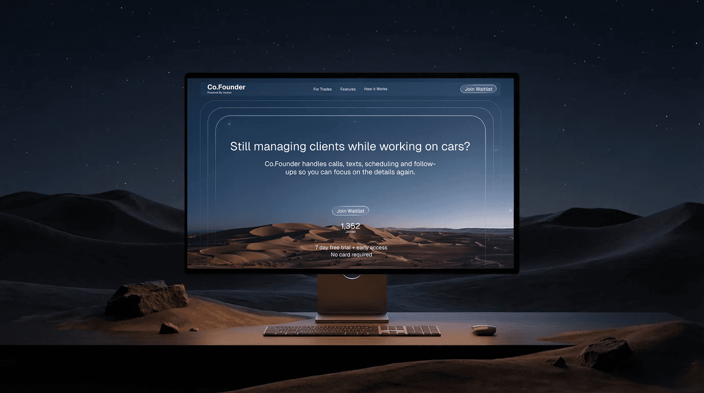
Co.Founder
An AI client manager for auto trades, sold to shop owners who care about a full calendar, not features.
view case studyTurn this into a
specific action plan.
This playbook shows the structure. The next step is making it specific to your real sales path: where visitors come from, what they need to understand, what proof already exists, where the page creates friction, and which changes should happen first.